

Operators: 5 Templates and 1–2 MB Rules for Digital Signage Layouts
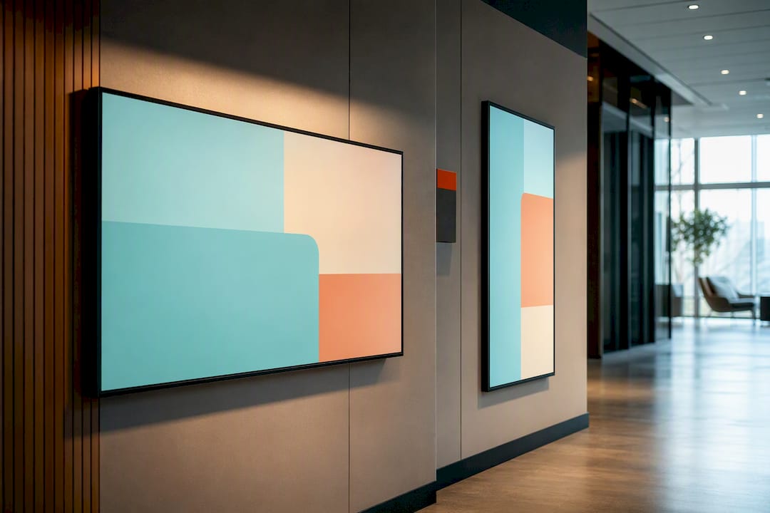
Use a zoned layout with a strict content hierarchy: divide the screen into a main content area plus one or two smaller support zones, and treat every element like it’s competing for a viewer’s four-second glance. Match your aspect ratio to the physical screen before you design anything, and cap headlines at five words or fewer with maximum contrast. Certain digital signage platforms build this structure into their templates so you don’t have to guess.
TL;DR:
Use a 16:9 aspect ratio for landscape displays and 9:16 for portrait screens to avoid stretching images and maintain professional appearance.
Export images at 72–96 DPI with a maximum file size of 15 MB, ideally under 2 MB for full-screen HD content, to prevent playback issues.
Follow the 3x5 text rule: no more than three lines, five words per line, with font size scaled to viewing distance, and prioritize high contrast for legibility.
Implement static zones for branding and time, while rotating promos or information within designated zones to keep screens engaging without clutter.
Use pre-designed templates for common layouts like menus, schedules, and promos to ensure consistency, rapid updates, and reliable performance across multiple screens.
Table of Contents
What Makes a Digital Signage Layout Work Technically
Before you place a single graphic, you need to know the box you’re designing for. Aspect ratio comes first: 16:9 for landscape displays (menu boards, lobby monitors, waiting rooms) and 9:16 for portrait screens (retail endcaps, elevator banks, narrow hallway displays). Mixing them up stretches your images and makes text look amateurish.
Resolution should match the display, not exceed it. A 1920×1080 canvas covers virtually every standard HD screen, and 4K only earns its keep on very large displays or when viewers stand close enough to notice the difference, according to guidance from Digital Signage Hub. For most gyms, offices, and restaurants, HD is plenty.
Export settings trip up more operators than layout design itself. Screens display at low resolution compared to print, so you don’t need print-grade DPI. Penn State’s digital signage team recommends exporting at 72 to 96 DPI and keeping HD image files under 15 MB, with 1 to 2 MB as the ideal target for full-screen images. Oversized files strain device memory and cause stutters, freezes, or dropped frames during playback.
Spec | Recommendation |
Landscape aspect ratio | 16:9 |
Portrait aspect ratio | 9:16 |
Standard resolution | 1920×1080 (Full HD) |
Export DPI | 72–96 |
Safe max file size | Under 15 MB |
Ideal file size (full-screen HD) | 1–2 MB |
Color space | RGB (never CMYK) |
Before you export anything, run through this checklist:
Confirm the canvas matches your display’s native resolution exactly.
Set color space to RGB, since CMYK is a print convention that washes out on screens.
Choose the right format for the content type (more on that below).
Compress the final file and check it lands near that 1 to 2 MB target.
Zoned Layouts and Templates You Can Copy Today
A zoned layout splits the screen into functional regions, each with its own job. The long bar runs along the top or bottom for tickers, time, or contact info. The corner box handles a logo, QR code, or weather widget. The ticker scrolls secondary text along one edge without competing for attention.
Five template patterns cover most business needs:
Menu board — hero zone for the featured dish or promo, a long bar listing prices, and a rotating ticker for specials.
Lobby info screen — hero zone for a welcome message or event, corner box for the clock and weather, long bar for building directions.
Retail promo wall — full-bleed hero image with minimal overlay text, corner box for a QR code linking to a sale.
Shift schedule + announcements — main zone for the schedule grid, ticker for company announcements underneath.
Gym class board — hero zone rotating through class times, corner box for instructor headshots, long bar for the day’s motivational quote or sponsor logo.
Keep some zones fixed and others rotating. Date, time, and branding elements should stay put since a moving clock is more distracting than helpful. Content lists, promos, and announcements work better as rotating playlists within their zone.
Consistency across locations means less retraining every time someone updates content.
How Should You Structure Text for Fast Reading?
Digital signage gets glanced at, not read. The 3x5 rule keeps you honest: no more than three lines of text, five words per line, per zone. Break that rule and viewers walking past a lobby screen simply won’t finish reading before they’re out of frame.
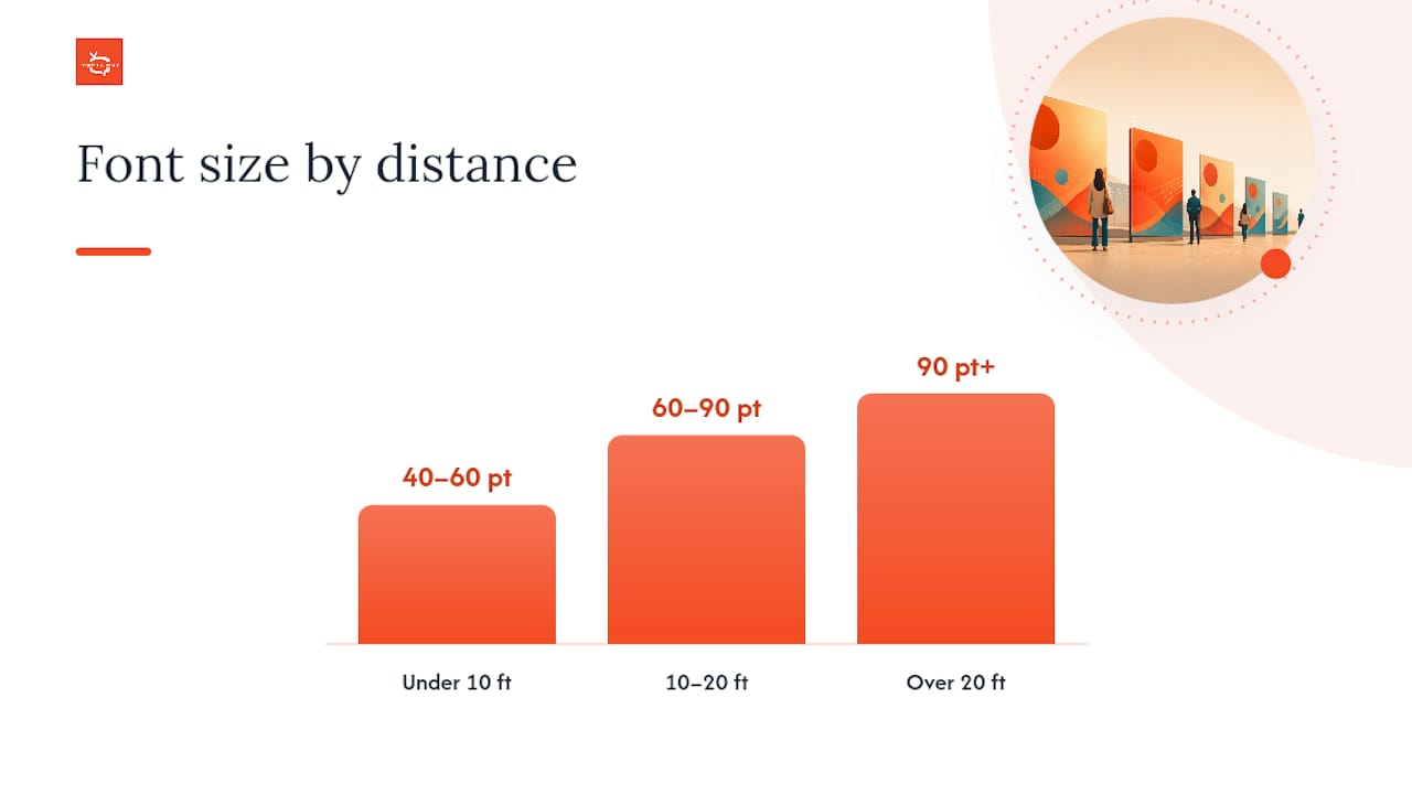
Font size depends on viewing distance and screen size. As a rough guide:
Under 10 feet viewing distance: 40 to 60 point minimum for body text.
10 to 20 feet: 60 to 90 point.
Over 20 feet (large format displays, stadium boards): 90 point and up.
Stick with sans-serif fonts like Helvetica, Arial, or Montserrat since their clean strokes hold up better at a distance than serif fonts do. Use medium to bold weight for headlines, keep letter-spacing slightly open, and set line-height around 1.2 to 1.4 times the font size so lines don’t crowd together.
Contrast decides whether text is legible or just decorative. Light text on a dark background (or the reverse) works best, and if text sits over a photo, add a semi-transparent overlay bar behind it so the words never fight the image for attention. Western Michigan University’s accessibility guidance for digital signage emphasizes exactly this: usability for legibility at a distance should outrank purely aesthetic choices every time.
Pro Tip: Stand at the exact spot your target viewer will be, on your phone, with the layout pulled up on a second screen or mockup. If you can’t read the headline in under two seconds, the font’s too small or the contrast is too low.
Choosing Images and Video That Won’t Break Playback
Format choice matters more than most people realize. Use JPEG for photographs and PNG when you need transparency, like a logo over a colored background. Skip print formats entirely; TIFF and EPS files are built for presses, not screens, and they bloat file sizes for no visual benefit.
Composition rules stay simple: one focal point per image, minimal text baked into the photo itself (let your layout’s text zones do that job), and authentic photography over generic stock whenever you can manage it. A real photo of your gym floor beats a stock image of strangers on treadmills.
To hit that 1 to 2 MB target for HD assets, compress images after resizing them to the exact canvas dimensions, not before. Tools that handle web image optimization apply similar compression logic to what signage platforms need, since both aim to cut file weight without visible quality loss.
Resize to exact pixel dimensions first, compress second.
Preview compressed files on the actual display before publishing.
Avoid embedding multiple high-resolution images in one rotating playlist item.
Oversized files strain device memory during playback. Penn State’s content guidance points to file sizes under 15 MB as a safe ceiling, with anything approaching that limit raising the odds of stutters or dropped frames, especially on older media players juggling multiple zones at once.
Building the Layout Step by Step in Any CMS
Most content management systems follow the same basic sequence, regardless of brand.
Design the canvas. Set your aspect ratio and resolution to match the target display before adding anything else.
Define your zones. Draw out the main zone plus any secondary regions (ticker, corner box, long bar) and lock their positions.
Assign content. Drop images, video, playlists, or live feeds into each zone according to the template you picked.
Set durations and scheduling. Decide how long each item displays and when the whole layout goes live versus when a different layout takes over (lunch menu versus dinner menu, for instance).
Preview and test. Check the layout on an actual device or accurate simulator, not just a desktop browser window.
Publish and assign displays. Push the finished layout to every screen or group of screens that needs it.
Before publishing, run this playback checklist:
Check | What to verify |
Aspect ratio | Layout fills the frame with no stretching or black bars |
Headline visibility | Primary message reads clearly at a one-second glance |
Fallback content | A default image or message loads if a feed fails |
Network status | Display is online and pulling the latest schedule |
Use playlists when a zone rotates through multiple items (specials, testimonials, sponsor logos) and single-item layouts when a message needs to hold steady, like a safety notice or wayfinding sign. Always set fallback content for any zone that pulls from a live feed. If your restaurant’s daily-specials integration hiccups, you want a static backup image, not a blank screen. SignStream’s scheduling guide covers how to stagger these transitions across dayparts without manual updates.
How SignStream Puts These Layouts to Work
SignStream builds multi-zone layouts, templates, and scheduling directly into its platform, so operators aren’t assembling these rules from scratch every time. You can update every zone across unlimited screens from any device, swap a lunch-menu layout for a dinner-menu layout automatically, and check performance through built-in analytics.
A gym running a class-schedule template alongside a promo zone for new memberships is a common setup. SignStream clients in fitness and hospitality have reported measurable gains after implementation, including a notable rise in class attendance tied to better-timed screen promotions.
Multi-zone templates for menus, schedules, and promos, ready to customize.
Instant updates pushed to every screen at once, no per-device logins.
Analytics to see what’s actually driving engagement.
If you manage a restaurant floor, SignStream’s restaurant-specific setup guide walks through template choices in more detail.
Getting Animation and Transitions Right
Motion draws the eye, which makes it powerful and dangerous in the same breath. A subtle fade or slide between playlist items signals “new content” without jarring anyone. A spinning logo or bouncing text does the opposite: it competes with your headline instead of supporting it.
Keep transition speed between half a second and one full second. Anything faster feels glitchy; anything slower feels sluggish on a screen people only glance at for a few seconds. Crossfades work well between full-screen images. Slide transitions suit ticker-style zones where content is meant to feel like it’s scrolling past.
Reserve animation for one element per screen at a time. If your hero zone is already rotating through images with a crossfade, don’t also animate the ticker with a bounce effect. Two moving elements fighting for attention is worse than one static layout, because viewers can’t tell which one to look at first.
Skip full-screen video loops unless the content genuinely needs motion, like a demo or a testimonial. Looping video for the sake of movement burns more processing power and file size for no communication benefit, and it often triggers the same playback strain that oversized image files cause.
Static content still has its place. Wayfinding signs, safety notices, and pricing boards read better without any motion at all, since the goal there is instant clarity, not visual interest.
What the Data Actually Tells You About Layout Design
Most digital signage advice treats layout as a design exercise. That’s backwards. The layout decisions that matter most are technical ones: file size, aspect ratio, and word count per zone. Get those three wrong and no amount of clever template design saves you.
The conventional advice oversells creativity and undersells constraint. A gorgeous layout that exceeds 15 MB will stutter on half your screens. A clever three-zone template with eight words per line will lose every viewer walking past at a normal pace. The 3x5 rule and the 1 to 2 MB file target aren’t creative limitations. They’re the difference between a screen that communicates and one that just displays.
Prioritize the boring stuff first: correct resolution, compressed files, short headlines, real contrast. Once those are locked in, template variety and animation choices become the fun part, not the load-bearing part. Operators who skip straight to visual polish without nailing the technical baseline end up rebuilding their layouts twice.
— DKS
Get Your Layouts Running Without the Guesswork
SignStream turns everything covered above into templates you customize rather than build from scratch, so you’re not manually setting DPI, aspect ratios, or safe margins on every screen you manage. You get multi-zone layout templates ready for menus, schedules, and promos, unlimited screen deployment at no extra charge as you add locations, and built-in analytics so you can see which zone or promo is actually driving results.
Instead of hiring a designer for every layout change, you update content across your entire screen network from your phone or laptop in minutes. If you’re also sitting on unused screen time, SignStream’s ad exchange marketplace lets you cross-promote with other local businesses and turn that inventory into revenue. See exactly how the workflow fits your locations by checking out how the platform works and starting a trial today.
Where to Go Deeper on Layout Specs
For export specs and file-size targets, see Penn State’s content design guide. For accessibility rules, review Western Michigan University’s guidance. For template galleries, browse SignStream’s platform guide.
Sources
Recommended
Comments