

ADA Digital Signage Requirements: What Managers Must Know

Yes, digital signage falls under ADA rules when the screen displays required or permanent information, such as room identification, wayfinding, or emergency notices. When that’s the case, you treat the screen the same way you’d treat a static sign: it needs to meet accessibility scoping rules, and in many cases, it still needs a companion tactile sign at the door. A screen that only shows rotating ads or temporary event promotions is a different story, and you’ll learn where that line falls in a moment.
Here’s the distinction that trips up most facility teams: a digital display, no matter how sharp or well-designed, cannot satisfy tactile sign requirements on its own. The Access Board’s guidance on Chapter 7 signs makes this explicit. If a screen at a door identifies a permanent room, it needs raised characters and braille nearby, whether that’s a physical plaque mounted next to the screen or a static sign somewhere close by. The screen can still carry the visual content, but it can’t replace the tactile element.
So your next move is straightforward. Walk your property, list every screen that displays wayfinding, room IDs, or safety information, and measure what’s currently next to each one. If you find a touchscreen directory at a building entrance with no tactile companion sign, you have a gap. If you find a promotional screen in a lobby showing class schedules that rotate daily, you likely don’t. The ADA Standards for Accessible Design from the Department of Justice remain the primary legal authority here, and every fix should trace back to that document or the Access Board’s technical guidance.
Table of Contents
Ada Digital Signage Requirements: When Does Scope Apply?
The ADA actually runs two parallel tracks for signage, and understanding both is the fastest way to know what you’re dealing with.
The first track is Chapter 7 of the ADA Standards, which governs physical signs, meaning tactile characters, braille, mounting heights, and pictograms. This track applies to signs that identify permanent rooms and spaces, provide direction, or communicate danger. The second track covers digital content accessibility, drawing heavily on W3C’s Web Content Accessibility Guidelines (WCAG) 2.1, which governs contrast, captions, and readability for anything shown on a screen. A single digital sign can trigger obligations under both tracks at once, or just one, depending on what it displays and where it’s mounted.
Knowing which scenarios fall into which bucket saves you from either over-engineering a simple promotional screen or under-protecting a screen that’s doing real wayfinding work.
In-scope, tactile required: A screen mounted beside a door that identifies a permanent office, restroom, or conference room needs a tactile companion sign per Chapter 7, since the screen alone cannot satisfy raised-character requirements.
In-scope, content accessibility required: A lobby directory screen showing building wayfinding, emergency evacuation routes, or class schedules needs WCAG-based contrast, font sizing, and often captioned video content, even if it doesn’t need braille.
Likely out-of-scope: Temporary event signage displayed for under seven days, seasonal promotional content, or pure advertising unrelated to a required service, though a cautious property manager still applies basic contrast and readability practices to these anyway.
Gray zone worth flagging: A gym class schedule screen that also serves as the only source for room assignments; if members rely on it to find where a class happens, that pushes it toward the wayfinding category.
Three quick questions settle most scope disputes on the spot. Is the information on the screen required to use the space safely or effectively? Is the screen installed at or near a door identifying a permanent room? Is the content permanent rather than a rotating temporary message? A “yes” to any of these means you should treat the screen as in-scope and start checking it against the technical rules below. When you’re unsure, the Access Board’s Chapter 7 documentation is worth reading directly rather than relying on secondhand summaries.
Tactile Sign Rules Under ADA Chapter 7
Every permanent room identification sign, whether it sits next to a digital display or stands alone, has to meet a specific set of physical measurements. These aren’t suggestions. They’re the technical backbone of Section 703, and inspectors measure against them literally.
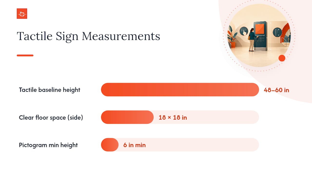
Raised characters must be duplicated in braille directly below the text, and the Access Board’s Chapter 7 requirements specify that the baseline of the lowest tactile character sits between 48 and 60 inches above the finish floor. That’s not a suggestion range you can round; it’s the legal mounting window. Below that sign, you need an 18 inch by 18 inch clear floor space, centered on the characters, so a person using a wheelchair can approach and read the sign at close range without obstruction.
Placement matters as much as height. Tactile signs go on the latch side of the door, not the hinge side, so someone can read the sign while standing clear of the door’s swing arc. If wall space on the latch side doesn’t exist, you’re allowed to mount the sign on the nearest adjacent wall, but it still has to meet the same height and clear-floor-space rules.
Requirement | Specification |
Tactile character baseline height | 48–60 inches above finish floor |
Clear floor space | 18 in. x 18 in., centered on tactile characters |
Character duplication | Raised characters paired with braille below |
Mounting location | Latch side of door; nearest adjacent wall if no latch-side space |
Pictogram field height | 6 inches minimum |
When you’re writing a sign order or an RFP, spell out every one of these specifications rather than trusting a vendor’s default template. Ask for the braille grade (Grade 2 is standard), specify a non-glare finish, confirm the character stroke width and depth meet code, and require mounting hardware that positions the baseline correctly on the first install. A sign that arrives correct saves you a second trip to fix a half-inch mounting error.
Pro Tip: Keep a laminated measurement card in your facilities office with the 48 to 60 inch window marked on it. New staff installing signs without that reference almost always guess too high, closer to standard eye level, and every one of those signs has to be re-mounted.
Visual Character Rules for Digital Displays
Even when a screen doesn’t need tactile characters, it still has to be legible, and the ADA’s visual character rules give you a concrete way to check that.
Section 703.5 requires non-glare finishes and strong contrast between characters and their background, either light characters on a dark field or dark characters on a light field. Table 703.5.5 ties minimum character height to viewing distance for physical signs, and while a digital screen doesn’t print characters the same way, the underlying logic transfers directly: text has to scale up as the viewing distance grows.
For digital content specifically, adopting WCAG contrast targets gives you a measurable standard: 4.5:1 for normal-size text and 3:1 for large text (18 point and above, or 14 point bold). Here’s what most facility teams miss: that contrast ratio is only accurate under controlled lighting. A screen with technically compliant 4.5:1 contrast can wash out completely under direct sunlight through a lobby window, so the on-paper number and the on-site reality can diverge fast.
Choose sans-serif fonts for body text; they hold up better at a distance and at smaller pixel sizes than serif fonts.
Avoid all-caps for anything longer than a short label, since all-caps text is measurably harder to scan quickly.
Limit each slide to one core message; screens crowded with multiple paragraphs lose the very people who need the largest text.
Apply the practical rule of one inch of letter height for every ten feet of viewing distance, a standard Western Michigan University uses for its own campus signage, as a starting point for font sizing on screens.
Test your contrast and font choices on-site, at the actual mounting location, during the brightest part of the day the space experiences. A slide deck that looks perfect on a designer’s laptop monitor can fail completely once it’s behind glare-prone glass in a gym lobby at noon.
Pictogram Field Rules and Required Text Descriptors
Pictograms carry their own set of technical rules, separate from character and braille requirements, and they’re easy to get wrong because the mistakes are subtle.
The pictogram field itself needs a minimum height of 6 inches, and it has to share the same non-glare finish and contrast requirements as tactile characters. Characters and braille cannot sit inside that 6 inch field; instead, a text descriptor goes below the pictogram, meeting the same visual-character rules covered above. This separation exists so the pictogram stays visually clean and the text stays legible on its own.
The most common pitfall is shrinking the pictogram to fit a crowded sign layout, which pushes it below the 6 inch minimum without anyone noticing until an inspection flags it. A close second is designers placing the text label inside the pictogram’s field boundary rather than beneath it, and a third is low-contrast pictogram artwork that technically meets the letter of “non-glare” while still being nearly invisible under fluorescent lighting.
Touchscreens, Kiosks, and Operable Parts
Interactive digital signage adds a layer of requirements that static signs never have to worry about: can a person actually reach and operate the controls?
Check the reach range. Forward reach for a person using a wheelchair typically tops out around 48 inches for an unobstructed approach, dropping lower when there’s a counter or obstruction in front of the screen. Side reach follows a similar logic. Mount interactive elements within these ranges rather than defaulting to a “comfortable standing height” that assumes every user is on their feet.
Verify operable parts don’t require tight grasping or twisting. Controls should be operable with a closed fist or limited dexterity, and they need to be tactilely discernible, meaning a person can find and identify a button by feel, not just by sight.
Never rely exclusively on gesture controls. A touchscreen that only responds to swipes or pinch gestures locks out users with limited mobility; pair gesture-based interfaces with simple tap-based alternatives.
Offer an alternative path to the same content. A QR code linking to an accessible web page, a nearby physical button, or an audio output option gives users who can’t operate the touchscreen a way to get the same information.
Watch session timeouts. If your kiosk times out and resets after a fixed period, build in an adjustable time limit or a warning prompt, since a person who needs more time to read or navigate shouldn’t lose their place mid-task.
Run these checks quarterly on any interactive kiosk, not just at installation. Software updates and content redesigns quietly shift button placement and touch targets more often than facility teams expect.
Content Accessibility for Digital Signage
Even a perfectly mounted, perfectly contrasted screen fails accessibility standards if the content itself excludes people. This is where WCAG principles do the heavy lifting, and university accessibility offices have already built practical playbooks for translating those web standards to a signage context.
Caption every video with speech. JMU’s digital signage guidance recommends captions as a baseline for any video content, since ambient noise in gyms, lobbies, and restaurants often makes audio inaudible anyway, which means captions help every viewer, not just those who need them.
Provide audio descriptions when a visual-only slide carries essential information, such as a safety diagram or a wayfinding map with no accompanying text explanation.
Never autoplay audio in a shared public space without a clear, easy way to mute or an alternative silent version of the same content.
Avoid flashing content above seizure thresholds, keep transitions slow and predictable, and skip rapid strobe-style animation effects entirely; they’re a hazard, not a design flourish.
Set minimum display duration based on reading time, not on what looks good in a rotation schedule. A rough guide is roughly one second per word plus a few seconds of buffer, so a twenty-word slide needs closer to twenty five seconds on screen, not the default five-second loop many templates ship with.
Pro Tip: Build your captioning into the content creation step, not as a fix afterward. Draft your video script first, run it through a captioning tool during editing, and proofread the captions against the actual audio before the video ever reaches a screen. Retrofitting captions onto finished signage video always takes longer than doing it up front.
Mounting, Glare, and Wheelchair Sightlines
Where you physically place a screen changes whether all of the character height and contrast work you just did actually holds up in the real world.

Mount screens so the readable content sits within a sightline that works from wheelchair height as well as standing height, and angle the display slightly downward if it’s mounted high, rather than perfectly vertical, to reduce glare from overhead lighting. A screen mounted directly across from a window without any tilt or anti-glare treatment will wash out every afternoon, no matter how strong the underlying contrast ratio is on paper.
Check sightlines by physically walking the approach path from roughly 3 to 10 meters out, since that’s the range most people will be reading wayfinding content from before they reach the screen. Stand at wheelchair eye height, not just standing eye height, and confirm the content is still legible from that angle. If a reflective floor or a nearby light fixture creates a glare hotspot at certain times of day, an anti-glare filter or a simple relocation often solves the problem faster than trying to redesign the content itself.
For screens in bright storefronts or gyms with skylights, scheduling a high-contrast template during peak sunlight hours is a practical mitigation that costs nothing beyond a scheduling rule in your content management system.
Running an On-Site ADA Signage Audit
Here’s a repeatable audit sequence you can run today with a tape measure, a phone camera, and about twenty minutes per screen.
Identify the sign type and scope. Determine whether the screen conveys permanent room identification, wayfinding, emergency information, or purely temporary/promotional content.
Measure the tactile baseline, if a companion sign exists, confirming the character baseline falls between 48 and 60 inches.
Verify clear floor space in front of the sign measures at least 18 by 18 inches and isn’t blocked by furniture, planters, or equipment.
Check visual contrast and character height against the display’s actual viewing distance, testing under real lighting conditions rather than in a dim back office.
Test captions and audio alternatives on any video content, confirming captions are accurate and synced, not just present.
Verify operable parts reach, if the screen is interactive, checking that primary controls fall within accessible reach ranges.
Document each check with a photo, the measurement taken, a clear pass or fail, and a next action if it failed.
Audit Item | Pass Criteria | Fail Action |
Tactile baseline height | 48–60 in. from finish floor | Re-mount or add companion tactile sign |
Clear floor space | 18 in. x 18 in., unobstructed | Relocate obstruction or sign |
Visual contrast | Meets 4.5:1 (normal text) or 3:1 (large text) | Adjust template colors or add anti-glare filter |
Video captions | Present, accurate, synced | Add or correct captions before republishing |
Touchscreen reach | Controls within accessible reach range | Remount lower or add alternative input |
Assign an owner and a timeline to every failed item, and loop in your sign vendor for physical remediation or an accessibility consultant for anything ambiguous. Keeping these audit records on file matters as much as the fix itself if you’re ever asked to demonstrate a good-faith compliance effort.
Who Enforces ADA Sign Rules, and What Happens If You Don’t Comply
Three enforcement paths bring ADA signage complaints to a facility’s door: the Department of Justice directly, state and local building code officials during permitting or inspection, and private litigation, which in practice is the most common trigger. A visitor or employee who can’t find a room, can’t read a wayfinding screen, or can’t operate a kiosk files a complaint, and that complaint frequently arrives as a demand letter before it ever becomes a lawsuit.
Noncompliance can lead to remediation orders requiring you to fix the sign within a set timeframe, sometimes under a consent decree.
Settlement costs for ADA sign complaints often exceed the cost of doing the installation correctly the first time, even before factoring in legal fees.
Reputational impact compounds the financial cost, particularly for gyms, restaurants, and retailers where accessibility complaints spread quickly through reviews and word of mouth.
Corrective work disrupts normal operations, especially if multiple locations in a franchise network share the same non-compliant template.
The most pragmatic risk-mitigation move is prioritizing permanent wayfinding and emergency signage for immediate remediation, since those carry the highest likelihood of a real safety impact and the highest complaint volume. Keep your audit records, your remediation timelines, and your vendor specifications on file. It’s worth noting that federal ADA rules set a floor, not a ceiling. Some states layer additional requirements through the ICC A117.1 standard or local building codes, so check your municipality’s requirements before assuming federal compliance covers you everywhere.
A Facility Manager’s Field Notes on Digital Signage Compliance
The mistake I see most often isn’t ignorance of the rules. It’s the assumption that “digital” automatically means “accessible,” when in practice a digital screen can fail every one of the checks a static sign would pass on day one. Teams swap a printed directory for a sleek touchscreen and treat the upgrade itself as the compliance fix, when the touchscreen still needs the right contrast, the right reach range, and, at doors identifying permanent rooms, a tactile companion sign it was never going to provide on its own.
Slide timing is the second-most common failure, and it’s almost always invisible to the person who built the content. A marketing team sets every slide to a uniform five-second rotation because that’s the template default, never accounting for the fact that a twenty-word safety notice needs far more than five seconds to actually be read by someone processing it slowly. Font choice trails close behind. Condensed, stylized fonts look sharp in a design mockup and become nearly unreadable at ten feet under gym lighting.
Pro Tip: Tie your sign audits to your existing preventive maintenance schedule instead of treating them as a separate initiative. If your team already does quarterly HVAC or fire extinguisher checks, add a five-minute signage spot check to that same visit. It gets done because it rides along with something that’s already on the calendar, rather than competing for attention as its own project.
Build accountability into that rhythm by naming one person, not a committee, who signs off on each quarterly check and owns the remediation list until every item clears.
How Signstream Helps You Keep Digital Signage Compliant
Signstream is the practical alternative to juggling separate vendors for signage hardware, content design, and compliance fixes. Because you manage every screen from a single cloud dashboard, you can push a corrected high-contrast template, an updated caption file, or a revised slide timing setting to every screen in your network at once, instead of physically visiting each location.

That matters most during remediation. If your audit turns up a contrast failure across a dozen lobby screens, you fix the template once and deploy it everywhere in minutes rather than rebuilding content location by location. Signstream’s remote deployment tools support exactly this kind of fast, network-wide correction, and the platform’s interactive ad templates can be configured with accessible touch targets and reach-appropriate layouts from the start. For readers weighing platform options for a new signage rollout, our beginner’s guide to digital signage platforms walks through what to look for beyond price. Sound layout and typography choices also matter here, and design resources like Depeche Code’s guide to modern layout trends pair well with the technical rules covered above. If your next step is fixing a specific screen or rolling out a compliant template across a whole location, request a Signstream demo and see how quickly a remediation plan turns into a deployed fix.
Key Takeaways
ADA compliance for digital signage depends on scoping each screen correctly, meeting exact measurement rules for tactile signs, and applying WCAG-based content practices to everything shown on screen.
Point | Details |
Run the scope test first | Ask if the screen shows permanent, required information; if yes, it needs tactile or content accessibility rules. |
Hit the tactile mounting window | Keep tactile character baselines between 48 and 60 inches with an 18 by 18 inch clear floor space. |
Caption every video | Add synced captions to signage video content regardless of ambient noise levels in the space. |
Test contrast on-site | Verify 4.5:1 or 3:1 contrast under actual lighting conditions, not just in design software. |
Deploy fixes network-wide | Signstream lets you push corrected templates and captions to every screen from one dashboard, speeding up remediation. |
Where to Read the Actual Code Language
Every rule summarized in this guide traces back to a small set of primary sources worth bookmarking directly, since summaries (including this one) simplify language that carries legal weight in its original form.
The Access Board’s Chapter 7 documentation is the definitive technical reference for tactile character dimensions, mounting heights, and pictogram field rules. When a vendor or contractor disputes a measurement, this is the document that settles it.
The U.S. Access Board’s Chapter 7 covers the technical measurements: character heights, mounting baselines, clear floor space, and pictogram fields. The Department of Justice’s ADA Standards page explains the legal scope, meaning which buildings and alterations these rules apply to and how enforcement works. For content accessibility, W3C’s WCAG guidelines, as applied through university guidance, translate web accessibility standards into practical rules for contrast, captions, and readable fonts on screens. Use the government sources for exact code language when you need to settle a dispute or write a procurement spec, and use the university guides when you need practical, day-to-day content design rules that WCAG itself states more abstractly.
Frequently Asked Questions
Does every digital sign need braille and raised characters? No. Only signs that identify permanent rooms or spaces, or that provide required wayfinding at a door, need tactile characters and braille. A digital screen showing rotating promotional content generally doesn’t need a tactile companion, but a directory screen identifying a permanent office does.
What’s the correct mounting height for ADA signage? The baseline of the lowest tactile character must sit between 48 and 60 inches above the finish floor, per Access Board Chapter 7 rules. This applies to the tactile companion sign, not the digital screen’s mounting height, which follows separate visual and reach-range guidance.
Can a digital display replace a tactile sign entirely? No. A digital display cannot satisfy tactile character and braille requirements on its own, regardless of resolution or contrast quality. If a screen sits at a door identifying a permanent room, it needs a physical tactile sign nearby.
What contrast ratio should digital signage content use? Adopting WCAG’s 4.5:1 ratio for normal text and 3:1 for large text gives you a measurable, defensible standard, though remember that ambient lighting can reduce effective contrast well below what your design software shows.
How often should I audit digital signage for ADA compliance? Tying a signage spot check to an existing quarterly preventive maintenance visit works well for most facilities. High-traffic wayfinding and emergency signage warrants more frequent checks, especially after any content or template redesign.
Who enforces ADA digital signage requirements? The Department of Justice, state and local building code officials, and private litigation all play a role. Most real-world complaints start as a demand letter from an individual who couldn’t navigate a space, not a government inspection.
This article provides general information on ADA signage requirements and is not a substitute for professional legal or accessibility consulting. Confirm current code language and local requirements with the U.S. Access Board, the Department of Justice, or a qualified accessibility consultant before finalizing any signage project.
Sources
Recommended
Comments